Characteristic shades – Trend analyst Nina Bruun selects the most prominent colors for 2019
How do we use interior colors in 2019? The renowned Danish trend analyst Nina Bruun sees that we are moving from pale ‘copy-paste’ homes to more expressive style with powerful color choices.
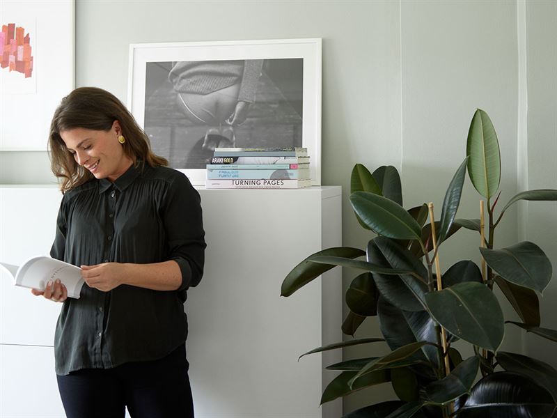
Bruun has chosen monthly color collages for Tikkurila Group throughout the year 2018, both paving the way in the design world and topical surfaces. Bruun, the former design manager of a Scandinavian design company Muuto, perceives that we have more courage to surround ourselves with colors and mix different shades together to showcase our personality. She feels that the domination of grey and white homes is coming to an end, and designers throughout the Nordics are moving towards more unique use of color.
Sustainability and individuality shaping our color selection
Trend analysts are apt to pick up the most interesting ones from the multitude of international phenomena. When researching for the future signals in interior design, Bruun often follows the most intriguing trends for example in the fashion industry. At the moment, she believes that sustainability, individuality and unsecure world are shaping our interior color choices the most.
“Colors are again a tool for self-expression. We want to create our own little oasis and shape our living, just like our digital presence in social media. Values and the respect for nature might be reflected via color and material choices we make. Each should find the colors that boost our wellbeing”, Bruun thinks out loud.
Nina Bruun’s color choices for 2019
When asking for the significant shades of 2019, Bruun highlights three color styles: natural tones, burned yellow and energizing pink.
Nature
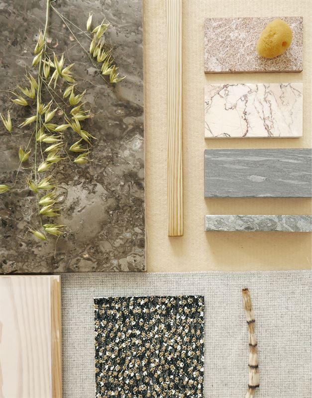
“I included nature because of the continuously increasing focus on sustainability and how we need to be better at taking care of our planet. Luckily this is not a tendency that is getting smaller and that might be why it feels so natural to reflect the nature that surrounds us by bringing it to our home and interior.”
Burned orange/yellow

“These deep and saturated colors fit perfectly to heavy materials like velvet and metals to give a rich expression and almost historical and royal references. It’s easy to implement in any home, just pick a few of your favorite elements to get the style. I see endless possibilities to make this color palette really personal.”
Pink
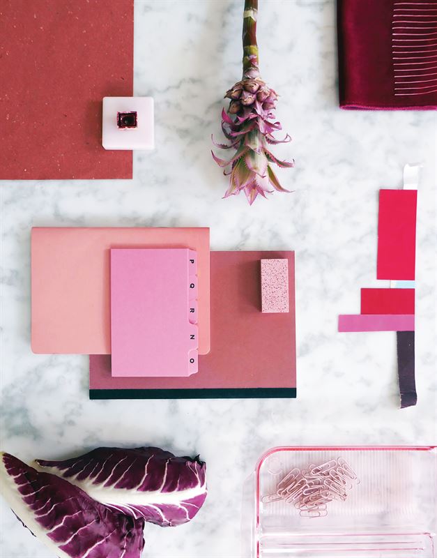
“Based on the economic crisis we came out of a couple of years ago, it has become easier to surround ourselves with things and colors that reflect joy and a positive mindset. It will be ideal to begin the new year with a fresh, positive set of eyes and an open mind. It is easy to implement this vibrant color by just starting small. Don’t be afraid of having fun.”
See all Tikkurila color collages by Nina Bruun
Get inspired by the color of the year 2019: K319 Flamingo
Further information:
Tikkurila Oyj
Nina Kaijasilta
PR, Group Communications
Tel. +358 40 757 3259
nina.kaijasilta@tikkurila.com
Images: https://imagebank.tikkurila.com/Login.jsp?colID=PkJhaOp2
Sustainable Nordicness
Tikkurila is a leading Nordic paint company with expertise that spans decades. We develop premium products and services that provide our customers with quality that will stand the test of time and weather. We operate in around ten countries and our 3,000 dedicated professionals share the joy of building a vivid future through surfaces that make a difference. In 2017, our revenue totaled EUR 582 million. The company is listed on Nasdaq Helsinki. Nordic quality from start to finish since 1862.
Tags:


