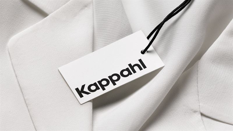
New Kappahl logo marks the start of a major transformational journey
With its new logo, rooted in the eminent fashion chain’s vibrant history, Kappahl marks the start of a major transformational journey. An entirely new brand strategy has been developed, which aims to shift Kappahl’s position towards a more values-based brand. A first step in this journey has been a new visual identity and updated logo.
“Kappahl is entering a new phase in its history. Many areas of Kappahl will change and develop over the coming years. Our goal is to create inspiring customer experiences every day,” says Kappahl's CEO Elisabeth Peregi.

Kappahl is currently undergoing a major transformational journey. For some time the fashion chain has been working internally to ready itself for continued growth, on new markets, in new channels and with new brands. These preparations have been made in part with the help of in-depth conversations with the chain’s chosen target groups.
“Over the past year, we have drawn strength from conversations with our customers, which has allowed us to develop our brand and position. This work has made the Kappahl team stronger and even more goal-driven,” says Elisabeth Peregi.To signal the start of this transformation, the brand has developed a new visual identity, of which its updated logo is an important component.
Echoes Kappahl’s graphic design heritage of the confident ’70s
Kappahl’s new logo is inspired by its graphic design heritage.
“Our heritage is unique. That is why we have analysed our graphic design history and drawn inspiration from Kappahl’s confident ’70s look. Round, geometric, assertive shapes and a slightly heavier typeface re-create that same visual character, without taking too big a step away from where we are today. We have also developed a unique typeface (Kappahl Type), which is based on the logo’s basic shapes,” says Madeleine Ahlström, Marketing Manager at Kappahl, who was involved in developing Kappahl’s new brand strategy.
Kappahl is also streamlining and modernising its logo by removing the upper-case “A”. The “A” was formerly a nod to the chain’s founder, Per-Olof Ahl. Now Mr Ahl is literally moving in with the more modern logo.
Kappahl's logo over the years

Just like its wider visual identity, the logo represents what Kappahl stands for; diversity in everyday life, and fashion fit for life.
“The new logo represents the future Kappahl. It is a first signal to our customers – and the rest of the world – of everything that is going on at Kappahl,’ says Elisabeth Peregi.
Kappahl's new brand strategy and design have been developed in collaboration with Lynxeye.
For more information, please contact
Charlotte Högberg, Head Corporate Communications, Kappahl, +46 704 715 631, charlotte.hogberg@kappahl.com
Kappahl exists to celebrate diversity in everyday life. We want to broaden the definition of diversity to include many different ways of living – empowering people to always stay true to themselves.
Founded in 1953 in Gothenburg, Sweden, the Kappahl Group is a leading fashion chain in the Nordics, with around 370 Kappahl and Newbie stores, and Shop Online in Sweden, Norway, Finland, Denmark, Poland and the UK.
The Kappahl team consists of some 4,000 colleagues at 400 workplaces in 10 countries, all with different backgrounds, ages, skills and styles. Our common motivation is to offer fashion fit for life to a wide variety of people and lifestyles – a Responsible Fashion that feels right, for the bearer and for the world we live in. Today, 70% of our products are labelled as more sustainable. Our goal is for 100% to be made of more sustainable materials by 2025.
For more information, visit www.Kappahl.com
Tags:


